
How we built Ezabella Dental a clinic site people trust
Nobody enjoys booking a dental appointment. Ezabella Dental was designed to lower the temperature: warm visuals, treatments explained in plain Arabic, and a booking button within reach on every screen.
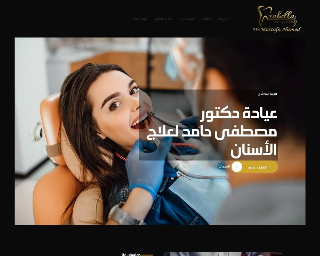
Scope of work
Exactly what was designed, developed and delivered on this build.
The Brief
Dr. Mostafa Hamed runs a dental practice, and in 2023 the practice needed a website. The job is the one a good reception desk does: reassure first, inform second, book third.
Healthcare sites usually get that order backwards. They open with clinical language and list procedures in terminology only a dentist uses.
Then they hide the appointment path behind a contact page. A nervous patient reads that and closes the tab.
So the brief was an Arabic site with a warm tone. Treatment pages a non specialist can understand without a search engine, and booking that never requires hunting.
None of that is decoration. A patient choosing a dentist is choosing a person, and the site is the only evidence they have before the first visit.
The Build
The design leads with warmth rather than clinical sterility. Softer color, generous spacing, and imagery that shows a calm practice instead of a stock operating light.
Typography is sized for comfortable reading in Arabic, not the dense blocks most clinic sites default to. Trust signals sit early, where a hesitant reader meets them first.
Treatment and service templates carry the content. Each treatment gets the same structure: what it is, when it is needed, and what the visit involves, written in plain Arabic.
A shared template lets the practice add a service without a redesign. It also keeps every treatment page answering the same questions in the same order, which is what makes a site feel dependable rather than assembled.
Photography did a lot of the work. Real rooms and real staff read as a place a patient can walk into. Stock imagery reads as a template.
Our website and app development team built it, and graphic design and brand identity set the tone of voice and the palette.
The Details
Everywhere. Booking is the primary action of the entire site rather than a page inside it.
The appointment path is reachable from the header, from the end of each treatment page, and from the mobile view where most patients are reading. The decision to book never has to survive a navigation hunt.
The form asks for what a clinic genuinely needs to schedule a first visit and nothing more. Every extra field on a medical form costs completions, and the practice can ask the rest on the phone.
The whole build is right to left, with Arabic treated as the design language rather than a translation layer. Reading order, form labels, icon direction and layout alignment all agree.
It is responsive across breakpoints and built light. A patient searching for a dentist is usually doing it on a phone, often in a hurry, and a clinic site that takes five seconds to load has already lost the appointment to whoever loaded faster. More builds sit on our success stories page.

What this record covers
This page documents the build: what was designed, developed and shipped. We publish performance figures only for engagements where we hold the measurement, which is why this entry reports scope instead of statistics. The programs we can measure are on the success stories page.
Dental clinic website design that lowers the temperature. Ezabella Dental explains treatments in plain Arabic and keeps a booking button within reach on every screen.
The playbooks behind this build
Website & App Development
Custom web and app solutions tailored to your needs. Responsive, user-friendly, conversion-engineered.
Learn MoreGraphic Design & Brand Identity
We recognize the impact of visual communication and the strategies required to leverage it for your success.
Learn MoreNeed a build like this?
Storefronts, RTL platforms, portals and booking flows. Tell us what the site has to do and we will scope it properly, then you decide.
Start a Project
Ready to be our next success story?
Every engagement on this page started with a free, no-strings audit. We will show you exactly where your funnel leaks revenue, and what we would do about it. Or keep reading: browse all case studies or explore our solutions.
Want the same, for your business?
Tell us where you want to grow. A senior strategist replies within 24 hours, with a first read on what you sent.