
Nedal
Corporate
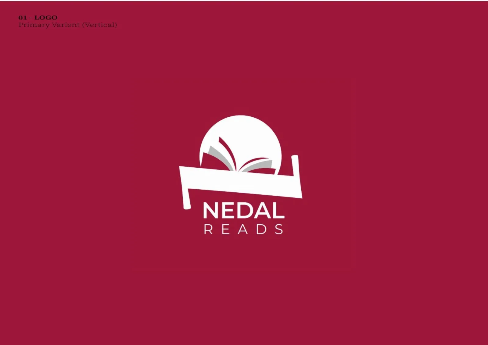
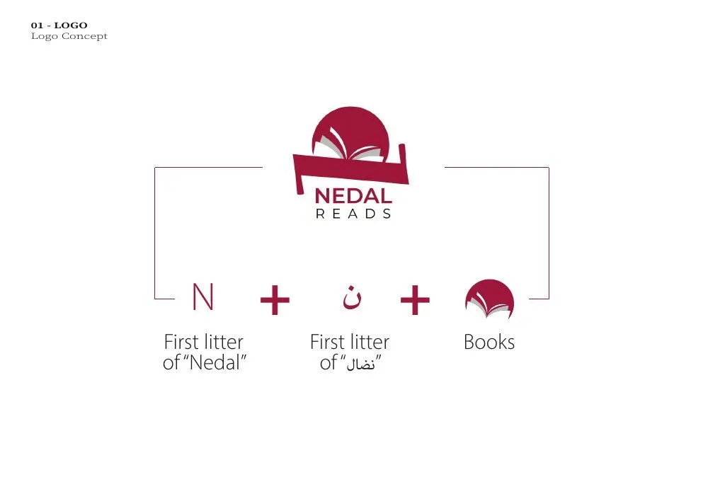
An identity logo design for Nedal Reads, a reading venture, and again a mark rather than a system. An open book fans its pages against a rising circle. A single bar cuts across the base and doubles as a shelf. Crimson carries it, with gray holding the second half of the page fan. The wordmark stacks NEDAL over a letterspaced READS, so the phrase reads as one unit at small sizes. The commission covered the concept and the logo, and we have not padded the page beyond that.
More Brand and identity work
Want the same, for your business?
Tell us where you want to grow. A senior strategist replies within 24 hours, with a first read on what you sent.